Digital systems built with creative precision.
This is the brand system for Nu Graphix — a South African digital systems studio that designs and builds websites, Payload CMS platforms, brand-to-web systems and digital workflows for growing SMEs. Everything a designer, developer or partner needs to express the brand consistently lives in these fourteen sections.
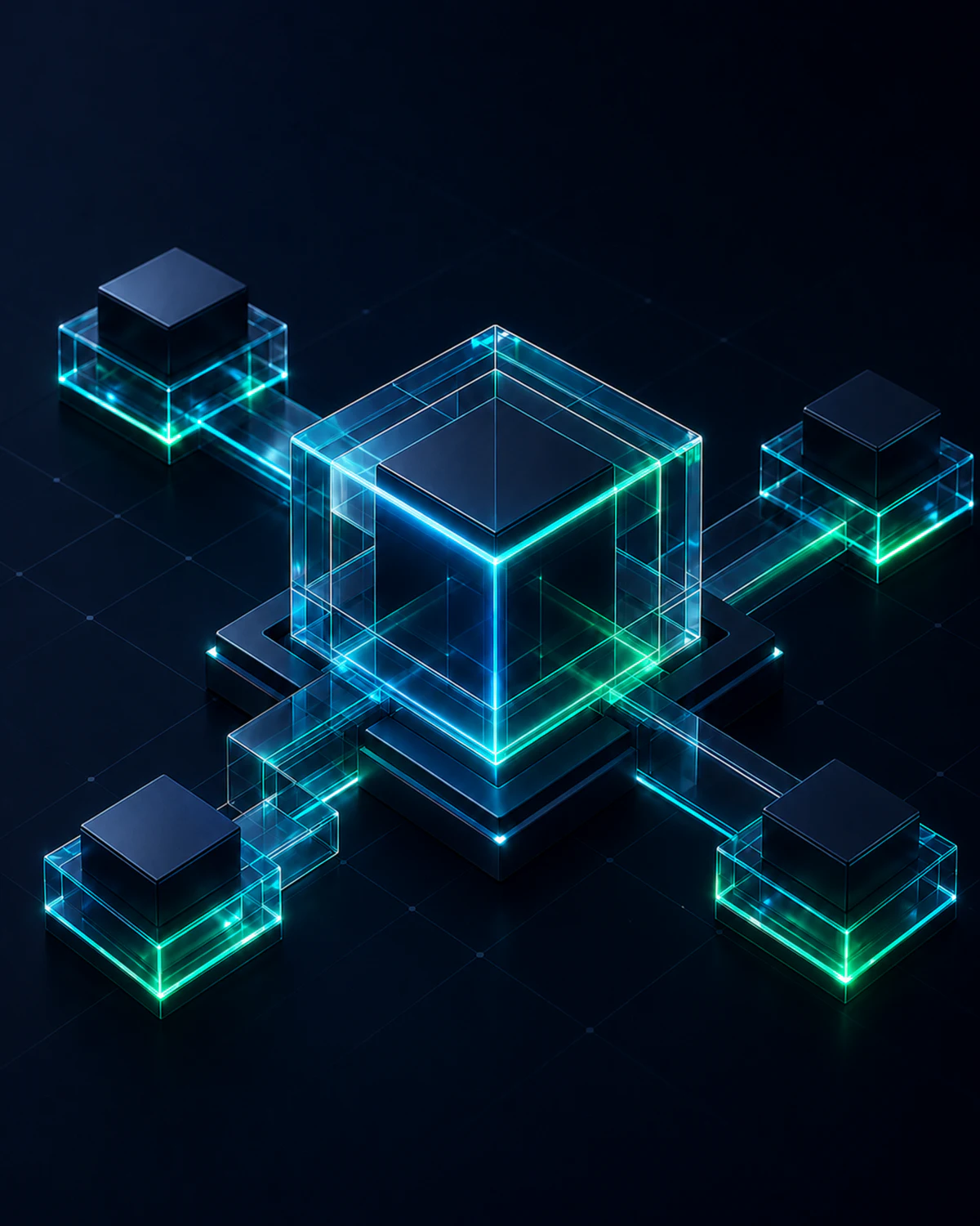 Nu System Core
4 Nodes · Connected
Nu System Core
4 Nodes · Connected
Identity
Logo system, colour, typography — the core identifiers of the brand.
System
Shape language, components and imagery treatments that build every surface.
Application
Services, workflow, proof, platform and website patterns that convert.
Brand Overview
Nu Graphix is a solo-led digital systems studio. Not a generic web agency, and not a once-off freelancer — a practical partner that takes South African businesses from scattered design, content and reporting needs to structured digital platforms.
Digital systems for growing South African businesses.
Websites, CMS platforms and digital workflows built with structure. From brand direction to working digital systems.
Design it clearly.
Build it properly.
Keep it running.
Every deliverable, proposal and platform should honour these three commitments — clarity in design, quality in build, reliability in support.
Design phrase
A dark-mode-first technical creative direction — blueprint grids, cyan/emerald glow, glass panels, modular structure, connected nodes and a premium studio finish.
Personality
The balance matters: technical enough to prove capability, warm and plain-spoken enough that a non-technical business owner never feels intimidated.
Owner-managed businesses, clinics, security companies, shopping centres, hardware & building suppliers, associations and community organisations — decision-makers who are not highly technical but need to feel confident.
“This is modern and capable. This is not overcomplicated. This person understands real South African businesses. This can grow with us.”
Voice
| We say | We avoid |
|---|---|
| “Your website becomes a system you can actually manage.” | “Leveraging synergistic omnichannel solutions.” |
| “We plan the structure before we design a single screen.” | “We ship pixel-perfect deliverables at scale.” |
| “Monthly support keeps it running and improving.” | “SLA-governed retainer engagement models.” |
Logo System
The Nu Graphix mark is an interlocking “N” built from two hexagonal circuit paths — cyan for design, emerald for development — joined by a gradient bridge. It represents the studio's core idea: brand and build, connected into one system.
Core variants

Brand marks
Primary mark
Avatars, favicons, app icons and small-space use.
Mono mark
Utility and UI contexts, single-colour print, watermarks.
Display mark
Glow treatment reserved for hero moments and loading states.

Maintain clear space equal to the height of the hexagonal mark (X) on all sides. Nothing enters this zone — no text, imagery or competing marks.
Never reproduce the full logotype below 120px width digitally. Below that, switch to the mark alone.
Improper usage
Colour System
A high-contrast, dark-mode-first palette. Slate carries the premium studio foundation, cyan drives action and technical glow, emerald signals growth and success, and violet is a restrained tertiary for platform moments only.
Brand anchors
Extended digital palette
Dark slate dominates. Cyan and emerald are accents — glow, actions, connections — never floods. Violet is the third voice: it marks platform, product and data territory, and nowhere else.
Semantic colours are functional only — forms, alerts, status chips. They never carry brand expression.
Accessibility — text on surfaces
| Combination | Contrast | Normal text | Large text / UI |
|---|---|---|---|
| Foreground on Near Black | 17.1 : 1 | AAA | AAA |
| Muted on Card Slate | 8.5 : 1 | AAA | AAA |
| Primary Cyan on Near Black | 11.9 : 1 | AAA | AAA |
| Cyan ink on Primary Cyan | 10.1 : 1 | AAA | AAA |
| Emerald ink on Emerald | 10.0 : 1 | AAA | AAA |
| Tertiary Violet on Near Black | 11.8 : 1 | AAA | AAA |
| Violet ink on Tertiary Violet | 10.6 : 1 | AAA | AAA |
| Violet Dark on Near Black | 4.5 : 1 | AA | AAA |
| Subtle on Near Black | 5.6 : 1 | AA | AAA |
| White on Cyan Core | 2.4 : 1 | Fail | Fail — use #001F26 |
Gradients
Gradients bridge design (cyan) and code (emerald); the Depth recipe marks platform territory. Use gradients on edges, borders and CTAs — never as large background floods.
Typography
A tri-font system balancing futuristic character with strict legibility: Bruno Ace gives the brand its geometric voice, Inter carries every paragraph, and JetBrains Mono grounds the system in its “built with code” reality.
0123456789
Single weight · 400 · use with restraint
0123456789 !@#$%
400 / 500 / 600 / 700 · workhorse readability
{ } => [ ] ( ) </>
400 / 500 / 600 · labels, metadata, code
Type scale
Structured pages, reusable blocks and an admin your team will understand — built on Payload CMS and Next.js.
Mono eyebrow → Bruno Ace headline → Inter body. This stack is the signature typographic rhythm of the brand.
Shape & Layout
The layout world is a blueprint: a fine grid behind everything, glass panels floating above it, node dots at meaningful intersections, and workflow lines connecting the pieces. Structure is visible — that is the point.
Shape language
Soft-rigid panels
12–16px radius on cards; crisp 1px borders.
Crisp internals
Inner elements use 4–8px radius — sharper than their container.
Pill signals
Badges and status chips are fully rounded with pulsing nodes.
Hexagon motif
Echoes the logo — reserved for marks, icons and diagram nodes.
Desktop uses a 12-column grid, max width 1180–1440px, 24px gutters. Column spans are deliberately asymmetric — a 5-column card beside a 7-column card — to keep the system dynamic rather than templated.
A 4px base unit drives all rhythm. Section padding runs 64–96px on desktop, 40px on mobile. Margins: 80px desktop / 16px mobile.
Depth — glass, light and glow
Blueprint world
Fine cyan grid + radial glows sit behind everything, establishing the “drawing board” the interface floats on.
Glass panels
Semi-transparent slate with 18–24px backdrop blur and directional lit borders — cyan top-left, emerald bottom-right.
Active glow
Interactive elements glow in their accent colour on hover/focus. Glow replaces drop shadows entirely.
Radius scale
Component System
Live components, rendered in this page's own CSS — the same tokens that will become Tailwind variables and ShadCN theme values. Hover and focus everything; the states are real.
Buttons
| Variant | Use | Notes |
|---|---|---|
| primary | One per view — the main conversion action | Cyan→emerald gradient, dark ink text, light sweep on hover |
| secondary | Supporting positive actions | Emerald soft fill |
| ghost | Tertiary links and cards | Cyan border, transparent |
| outline / mono | Neutral & technical contexts | Mono variant for dev-flavoured CTAs |
Badges & status
Form / discovery inputs
Code & spec cards
Code cards and path breadcrumbs are brand components in their own right — they express the “built with code” story on marketing pages.
System cards
Imagery & System Visuals
Nu Graphix shows real work, not stock photography. Screenshots, Figma frames, admin views and system diagrams — always framed in dark slate, annotated with technical labels.
- ✓Screenshots of real client projects in browser frames
- ✓Figma frames and design-system boards
- ✓Payload CMS admin views and code editor crops
- ✓Before/after website comparisons
- ✓Process and system diagrams with labelled nodes
- Corporate stock people and office photos
- Random AI-generated tech backgrounds
- Overused circuit-board / “AI brain” imagery
- Generic laptop mockups with nothing real on screen
- Busy screenshots without annotation
Standard treatment — browser frame
framed · labelled · annotated
Every screenshot sits in this dark browser frame with a mono URL and a status chip. Captions use JetBrains Mono labels in cyan or emerald.
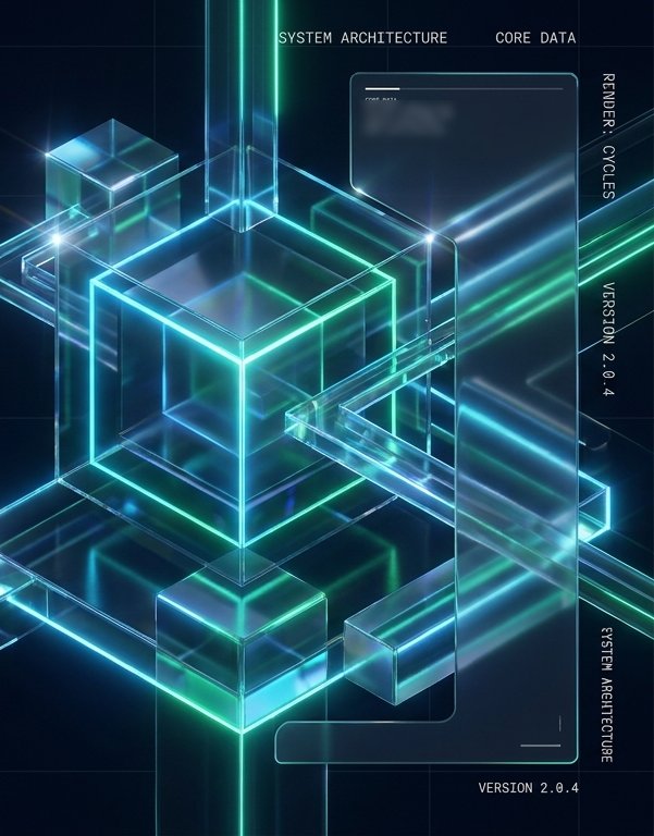
3D system renders
The premium imagery tier: glass-and-neon 3D structures rendered in the brand world. Reserved for hero moments, campaign banners and social cards — never for everyday page content.
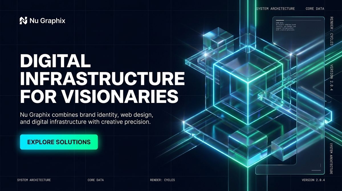
- ✓Transparent glass volumes — cubes, slabs, beams — on near-black slate
- ✓Neon edge lighting in cyan and emerald; violet only as a deep-space glint
- ✓Blueprint wireframe grid receding into the background
- ✓HUD-style mono labels at frame edges (SYSTEM ARCHITECTURE · VERSION x.x)
- ✓Light streaks sweeping diagonally, one dominant direction per artwork
native SVG fallback — when a render is too heavy, use wireframe motifs
System diagram style
Diagrams use hex/rounded nodes, thin gradient connectors, signal dots at junctions, and mono labels — cyan for design-side nodes, emerald for build-side nodes.
Services & Offers System
Six productized offers with a clear pathway between them. Cards stay plain-spoken — a non-technical SME owner should know which one is theirs in seconds.
Offer pathway
Every offer leads naturally to the next. The retainer is the destination — long-term, structured digital support.
Comparison layout
| Website MVP | CMS Website | Platform | |
|---|---|---|---|
| Editable content | — | ✓ Payload CMS | ✓ Payload CMS |
| Design system | ✓ core tokens | ✓ full system | ✓ full system |
| Blog / news / directories | — | ✓ | ✓ |
| Portals / dashboards / reporting | — | — | ✓ custom |
| Typical timeline | 2–3 weeks | 4–8 weeks | phased |
Keep it running. Keep it improving.
Monthly support covers updates, content, reporting and continuous improvements — the “keep it running” half of the brand promise.
Project Workflow System
The process is the biggest trust-builder Nu Graphix has. Six named stages, always shown as a connected system — clients see exactly where their project is and what happens next.
The Nu Graphix method
- ✓Design tokens exported to Tailwind config
- ✓Components mapped to Payload blocks
- ✓Content loaded and reviewed
- ✓Admin training session completed
- ✓Analytics & reporting connected
- ✓Support retainer activated
// click items to toggle — demo
stage 3/6 · 50% complete
Design-to-dev pipeline
The same pipeline that produced this brand guide is the one clients buy — design decisions flow into working code without translation loss.
Case Study / Proof System
Proof beats promises. Every case study follows the same structure: challenge → solution → result, with real screenshots, tech stack labels and honest metrics. Only approved public work appears on the website.
Case study cards
Challenge / solution / result
Outdated site, scattered brand files, no way to update content, zero reporting.
Brand-to-web system, Payload CMS build with reusable blocks, structured content workflow.
Team updates content in-house, enquiries up, monthly reporting in place, retainer active.
Before / after
- Static site, developer needed for every edit
- Inconsistent logos and colours
- No mobile experience
- No analytics or reporting
- Payload CMS — team edits everything
- One design system, everywhere
- Responsive, fast, accessible
- Monthly reports and improvement loop
Results / metrics card
Platform & CMS System
The technical differentiator, explained simply: a modern stack where content, design and code stay connected. Violet accents mark platform territory throughout the brand.
Content workflow
Admin preview
Reusable block system
Standard Payload block library — every site is assembled from brand-true components:
Forms, WhatsApp, maps, analytics and reporting connect into the same system. The retainer closes the loop: measure → report → improve → repeat.
Website Section Examples
The system applied — key sections of the future nugraphix site rendered live in this guide's own components.
Hero
Websites, Payload CMS platforms and digital workflows — planned, designed and built with structure. Then kept running.
Services strip
Contact / discovery
A short discovery call, a clear plan, and an honest recommendation — even if that's “you don't need us yet.”
Brand applications
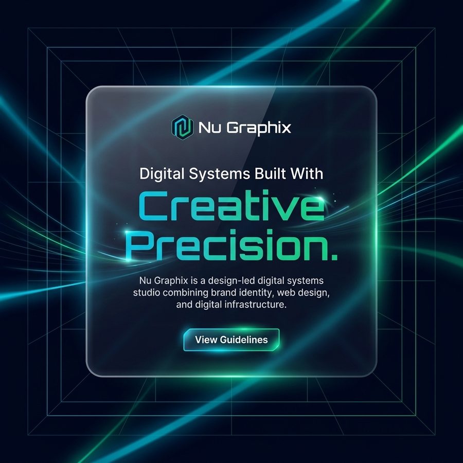
The two approved marketing formats, rebuilt live in system components — use these as the template for social posts, email headers and campaign banners.
Nu Graphix is a design-led digital systems studio combining brand identity, web design and digital infrastructure.
Nu Graphix combines brand identity, web design and digital infrastructure with creative precision.
Motion & Interaction
Motion is calm and purposeful — systems coming online, connections being drawn, panels settling into place. Nothing bounces, nothing spins.
2s ease loop · live indicators, status nodes
1.6s cubic-bezier(.6,0,.2,1) · workflow lines, progress
.6s stagger ×150ms · cards entering on scroll
2.2s ease loop · loading states, audit visuals
Choreography
node .35s → wire .5s → next node · process sections animate left to right, once, on scroll into view
Fade + 10px rise, 350ms ease.
.35s ease · fade + translateY(10px) · used for every view/route change
Loading & feedback
1.5s linear loop · content placeholders — slate tones only, never accent colours
enter: .3s rise + fade · hold 1.6s · exit: fade — one line, mono, cyan glow border
Interactive glow states
Three intensity tiers, one per state — glow never stacks beyond the active tier, and only one element per region may hold the active tier at a time.
Timing & easing tokens
| Token | Value | Use |
|---|---|---|
| instant | 100ms | State flips — checkbox, segmented control |
| fast | 200ms | Hover, focus, glow changes |
| base | 300ms | Panels, menus, toasts, view fades |
| entrance | 600ms | Section entrances with stagger |
| draw | 1600ms | Connector lines, progress reveals |
UI response — settles quickly, no bounce.
Connector lines — slow in, confident finish.
Status loops only — pulse, shimmer, scan.
Interaction rules
Brand Rules
The non-negotiables. When in doubt, come back here.
NU GRAPHIX · BRAND SYSTEM v1.1 · 2026